

Choice activity

The Choice activity is a simple activity: managers ask a question and offer different possible answers. It can be used as an introduction to a specific topic or to decide which topic should be deepened. You can also use Choice to get an opinion on a particular question.
A Choice activity requires a certain amount of preparation time to create the activity in RWTHmoodle and to determine suitable options to select from. The effort for the actual voting process (i.e. the voting by students) is minimal.
For this activity, you can use Tagging (Tags).
1. Add Choice
- Switch the course room to edit mode using the "Edit mode" slider next to your name in the upper right corner.
- Click on the link "Add an activity or resource" in the appropriate course section.
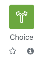
- Click on the icon for "Choice"
- You will automatically be redirected to the settings page to configure the Choice activity.
2. Choice settings
2.1. Basic entries
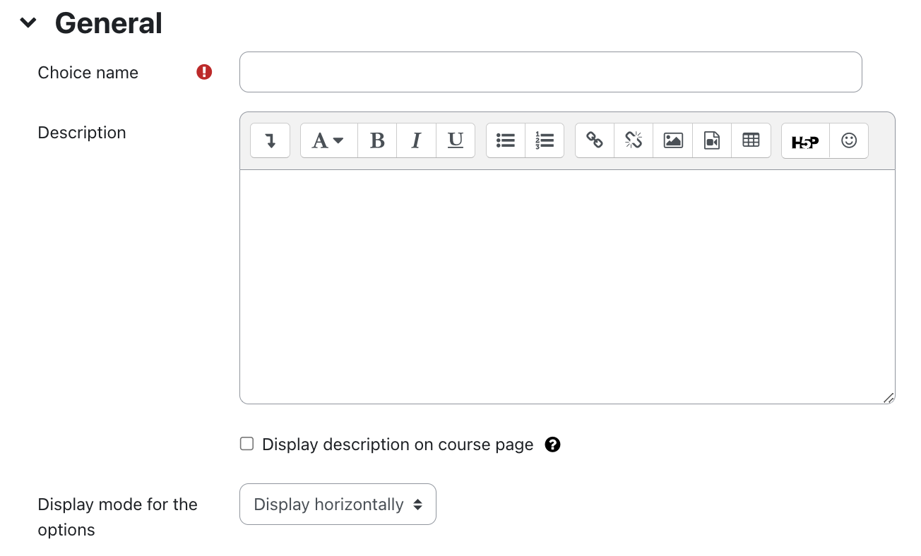
- Choice Name - This is the name of the vote that will be displayed on the course page.
- Description - Describe the activity here. The description should include the question the students will vote on. An example could be: "What is your favorite color?"
- Show description on course page - If you check this box the above description will be displayed directly on the course page.
- Display Mode for the option - Use this setting to determine how the voting options are displayed: horizontally or vertically

Note
2.2. Options

- Allow choice to be updated - If you set this setting to "Yes", students can vote repeatedly within the voting period, i.e. change their vote. If you set this to "No", students can only vote once and cannot change their minds after that.
- Allow more than one choice to be selected - If you set this setting to "Yes", students can vote for more than one option at a time. The display of the selection options is different: If exactly one option is selected, the box to be marked is round, if multiple options are selected, the box is square.
- Limit the number of responses allowed - If you check this option, you can set an upper limit on how many votes can be cast for each voting option on your question. Once this limit is reached, no one can vote for this poll option anymore. If the upper limit of a voting option is set to zero, this means that no one else can vote for that voting option.
By default, the upper limits are switched off, which means that the number of votes per voting option is unlimited.
- Option 1, 2, etc. - Here you specify the individual answer options for your question. In our example with the colors, possible answers would be blue, red, yellow, or green.
- Upper limit 1, 2, etc. - If you have activated the upper limits for voting, you can enter the number of possible votes here.
There are five voting options by default. If you need fewer options, leave the remaining fields blank. If you need more than five options, you can create as many additional options as you want. To do this, click on the button "Add 3 fields to the form".
2.3. Availability

- Allow responses from - Select the start of the voting period.
- Allow responses until - Select the end of the voting period.
If you want an open-end (with a fixed start of the voting period), select a date far in the future as the end time. If you want an open start, select a date in the past accordingly. If you do not want to restrict the period, leave the checkbox deactivated.
- Show Preview - If you select this checkbox, students will see the voting options even outside the period in which voting is allowed.
2.4. Results
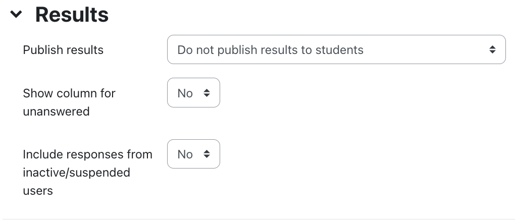
- Publish results - With this setting, you determine if and when students can see the results of the voting. Possible options are:
- Do not publish results to students
- Show results to students after they answer
- Show results to students only after the end of choice
- Always show results to students
Privacy of results - If you specify that students can see the results of the choice, then you can use this option to determine whether the results should be shown with or without a name.
Note
Managers always see the choice results completely with name and vote. Anonymity refers only to the way in which participants see each other's votes (anonymously or by name).- Show column for unanswered - If you set this setting to "Yes", an additional column will appear in the choice containing all students who have not yet made their choice. If you set this to "No", only the choice results of students who have already made a choice will be displayed.
Students will see a preview of how the choice results will be displayed on the voting page.
2.5. Common module settings
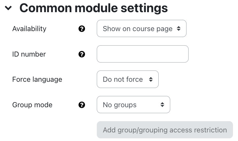
- Availability - Choose whether you want the choice to be immediately visible to students or hidden from them.
- ID Number - The ID number is used to assign a name that can be used in the "Grades" section when calculating overall grades. If the choice is not needed to calculate grades, the field can be left blank.
- Group Mode - There are three different settings for Group Mode: No Groups - Separate Groups - Visible Groups.
- Grouping - A grouping is a collection of groups. If the availability of choice is limited to group members, only students in the groups that are in the selected grouping can participate in the choice. The group settings must be set to separate or visible groups.
2.6. Restrict access
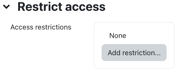
These settings allow you to link the visibility and availability of the choice to certain conditions for the students. For more information, see the article Restrict Access.
2.7. Activity completion
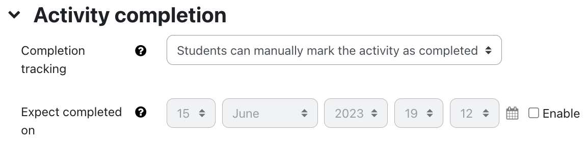
You use these settings to define criteria or conditions when an activity is considered completed (that is, successfully processed). For detailed information, see the article Activity completion settings.
2.8. Save
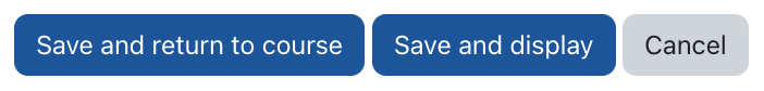
Then click "Save and return to course" to create the choice and return to the course page.
2.9. Notification about content change
The settings for the activities can be reached after creating them within the activity via the central menu navigation. Here you will find activity-specific settings and you can also save the activity directly individually.
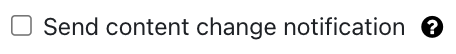
If you subsequently make changes to the settings, activate the checkbox "Send notification of content change" to inform all participants about the new or changed activity. All participants who can access the activity receive the notification.